Fruits of the Orchard
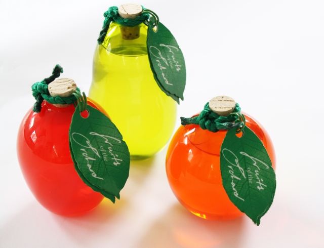
This self written brief was initially created to boost the packaging appeal of Boots Fruit Essence shampoos and conditioners. I wanted to give the products a whole new brand identity with packaging that would make the products stand out and give them their own originality. The brief evolved into a repackaging and rebranding project. The main source of inspiration I had for the design of the fruit shaped bottles was a novel set of fruit shaped soap on sale as christmas stocking filler within the Bodyshop.
YCN – M&S Picnic Brief
This was a competition brief set by YCN http://education.ycnonline.com/student/
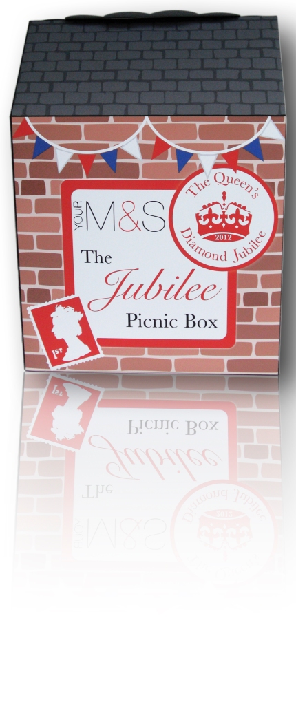
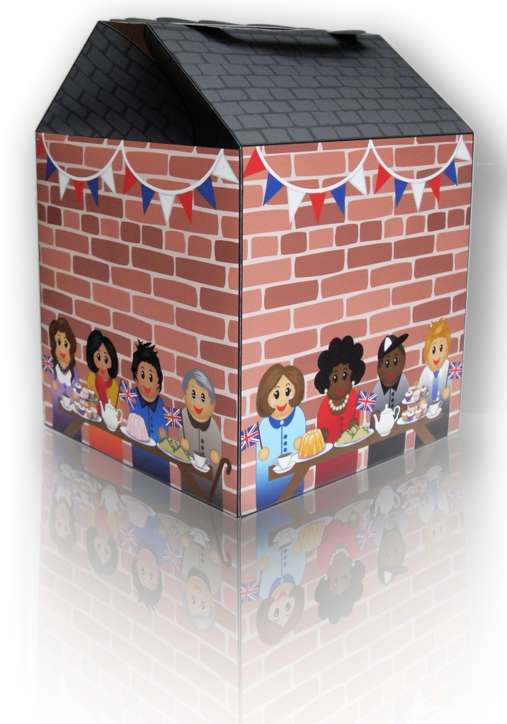
The brief was to package the perfect picnic, celebrating a special event or occasion. My response to this brief was to create a street party themed picnic box to commemorate Her Majesty The Queen’s Diamond Jubilee for families who where attending their local street party or having their own picnic. On my packaging I wanted to illustrate what being in community and being part of an event really means.
Cook Fresh Herbs
For my second final major project, I created ‘Cook Fresh’, a revolutionary herb brand to inspire and educate consumers to cook with fresh ingredients from scratch. Herbs are the key ingredient within a meal to enhance its flavour. The brand aim is to encourage consumers away from resorting to microwaving convenience dinners or ordering takeaways that are packed full of saturated fats and high levels of salt. The products are targeted towards people who lack confidence in their cooking.
The ‘Cook Fresh’ packaging is in the layout style of a cook book without being heavy and clumsy. On the outside of the packaging, there is a super quick and simple recipe to aid the consumer in cooking their initial meal. The ingredients are listed in the style of a shopping list. In the inside of the packaging (when the velcro tabs holding the net together are released) there is two more additional recipes as well as a secret QR code taking the consumer to more quick and simple recipes and a social networking platform, where you can share your own with other users on the ‘Cook Fresh’ website.
I chose to keep the design of the packaging really clear and concise, as not to confuse the users. I also opted for an illustrative element within my packaging design to make the packaging stand out within a supermarket environment. I used coloured illustrations on the front but used black and white loose illustrations on the inside of the packaging as inspired by the modern style of illustrations by Trevor Flynn in The Sugar Club Cookbook.
The Sorrell Project
Before >
After >
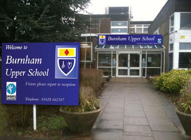
 This was a project set up by The Sorrell Foundation, Buckinghamshire County Council and Bucks New University. The project was a collaboration of bucks creative students, who where split into small groups and allocated a brief set by creative students from a local secondary school. The school we got partnered with was particularly run down and brief they set us was to redesign the signage for the school.


